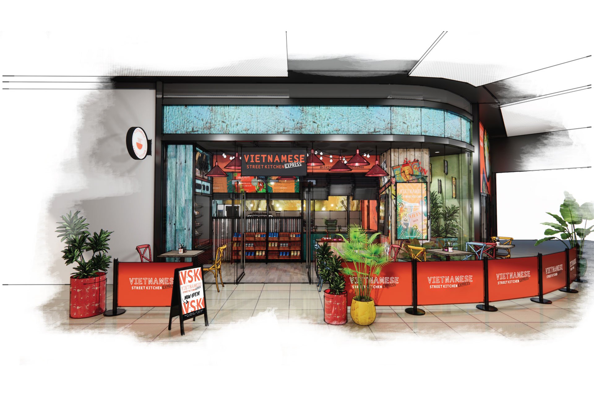
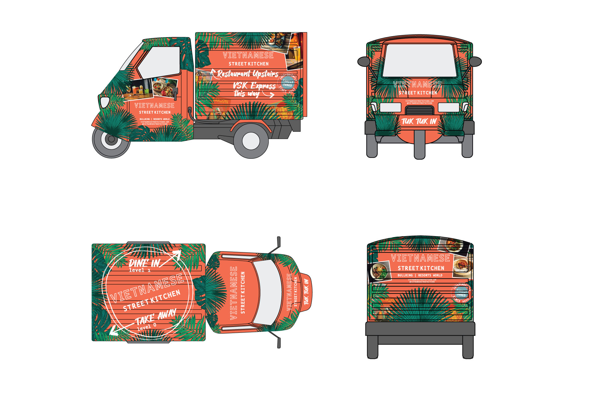
VSK Express
Branding to extend a Vietnamese restaurant group into the grab-n-go category.
"Extending the VSK brand into the grab and go category called for visual impact, simplicity and direct messaging."
What’s the story?
Client / Vietnamese Street Kitchen
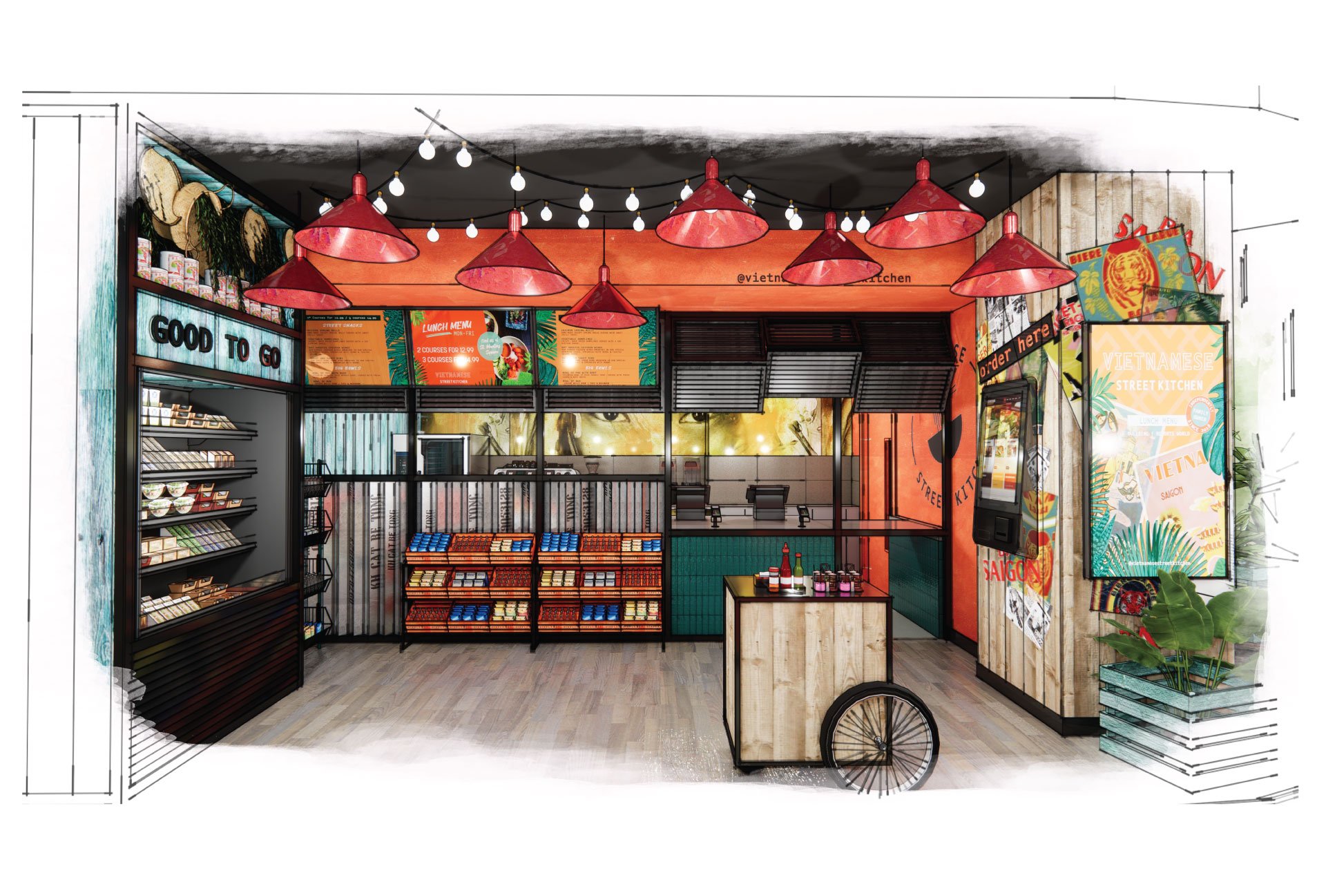
Area / 43.5m2
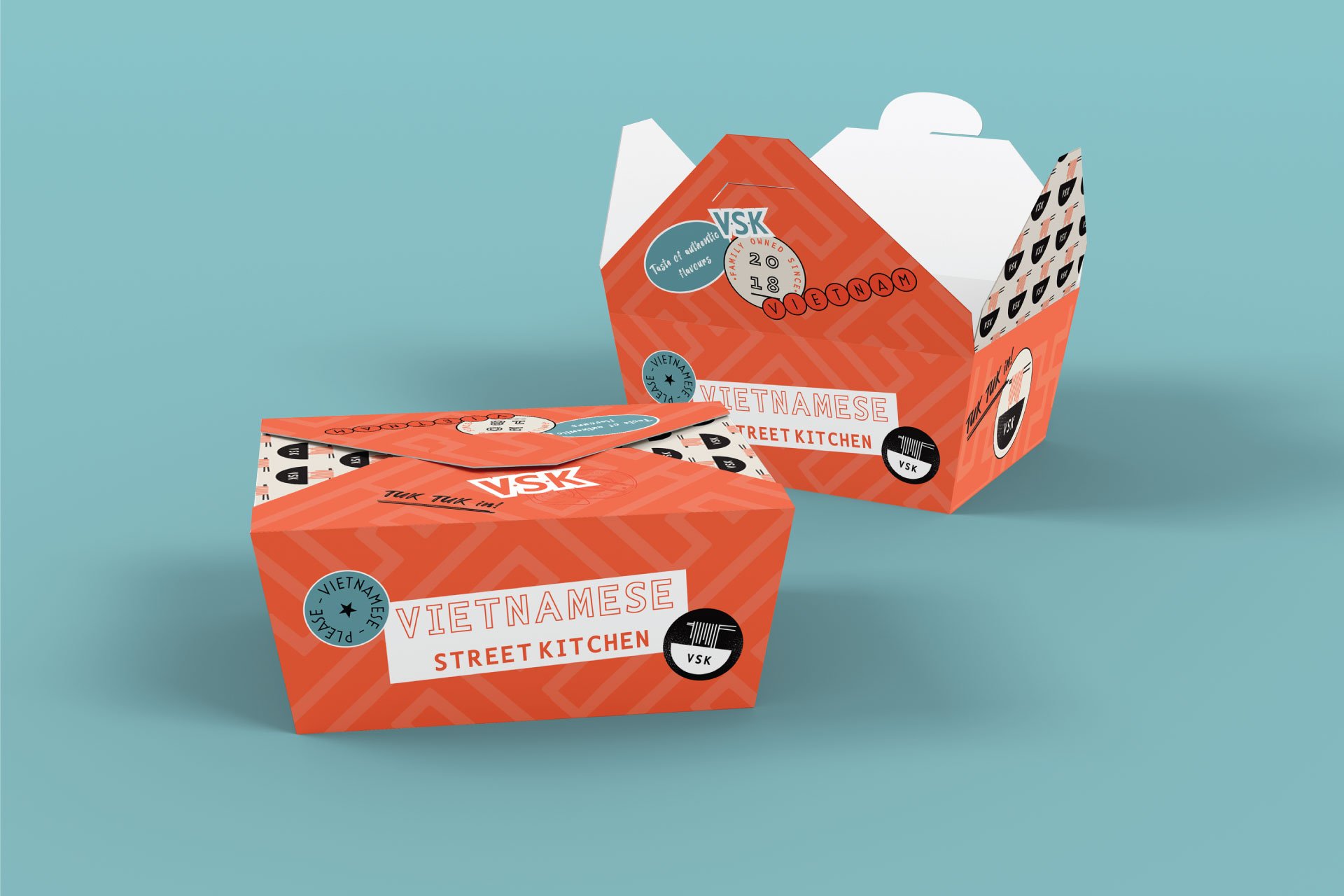
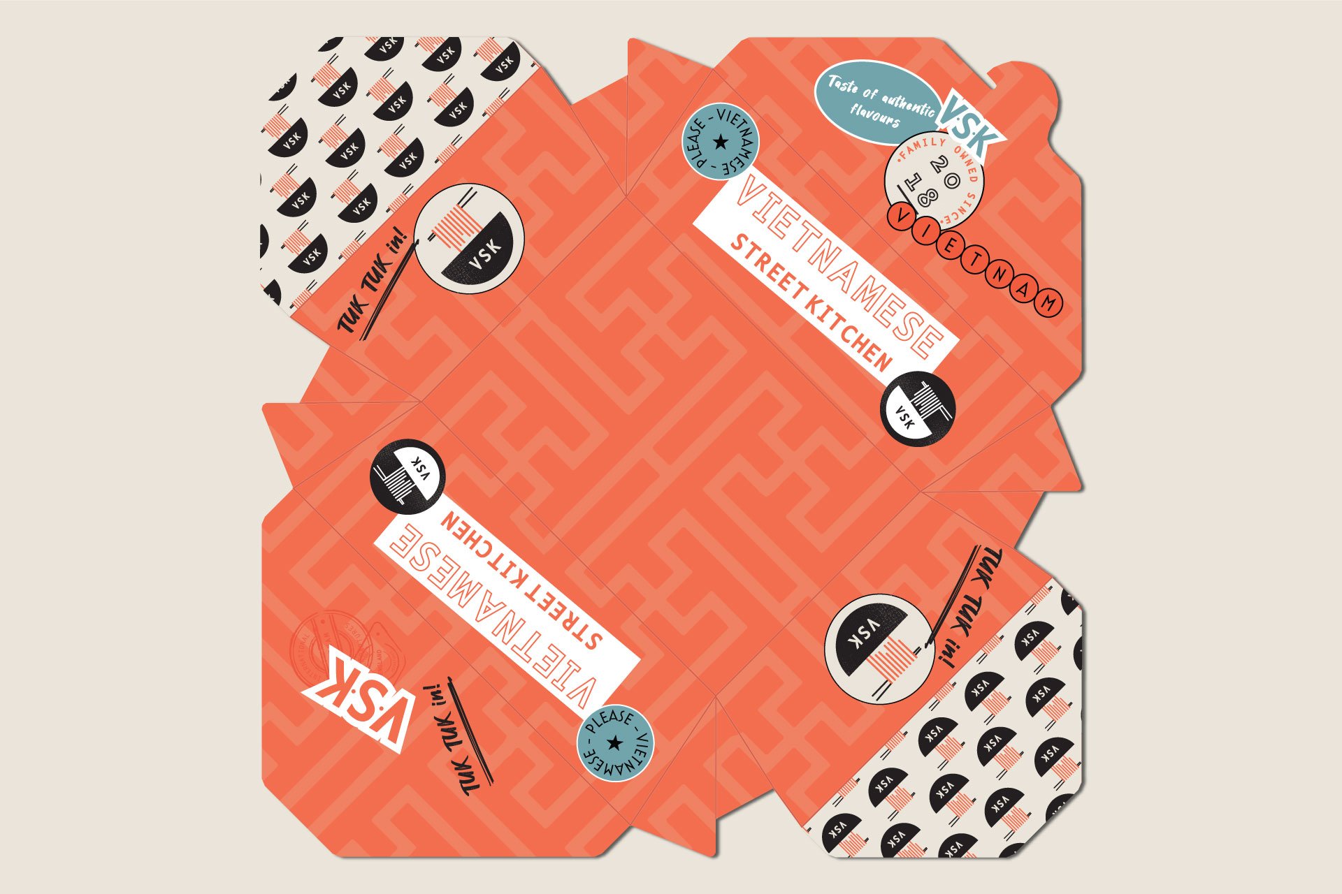
VSK Express is the development of an independent and family-run group of Vietnamese street food restaurants. Due to the success of their main restaurants, growth is planned in the form of a compact, grab-n-go store format. The brief for the design was two-fold; firstly, to extend the brand, creating greater visual presence; secondly, it needed to work alongside the existing branding, removing the need for a company-wide rebrand.
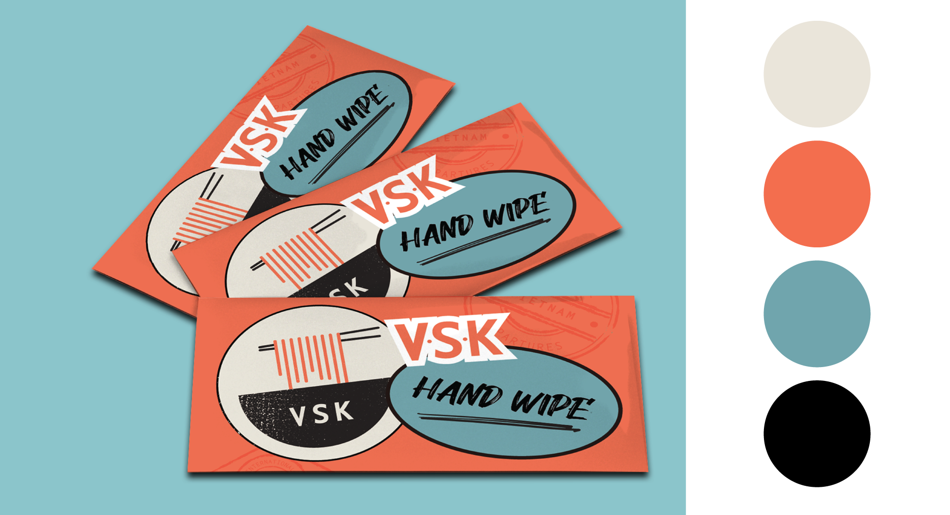
In many ways, for the brief to work within the current brand guidelines it was quite restrictive; the primary typeface and colour palette were to remain. This created a challenge; how can we create clear differentiation and greater visual impact without changing these two fundamental factors?
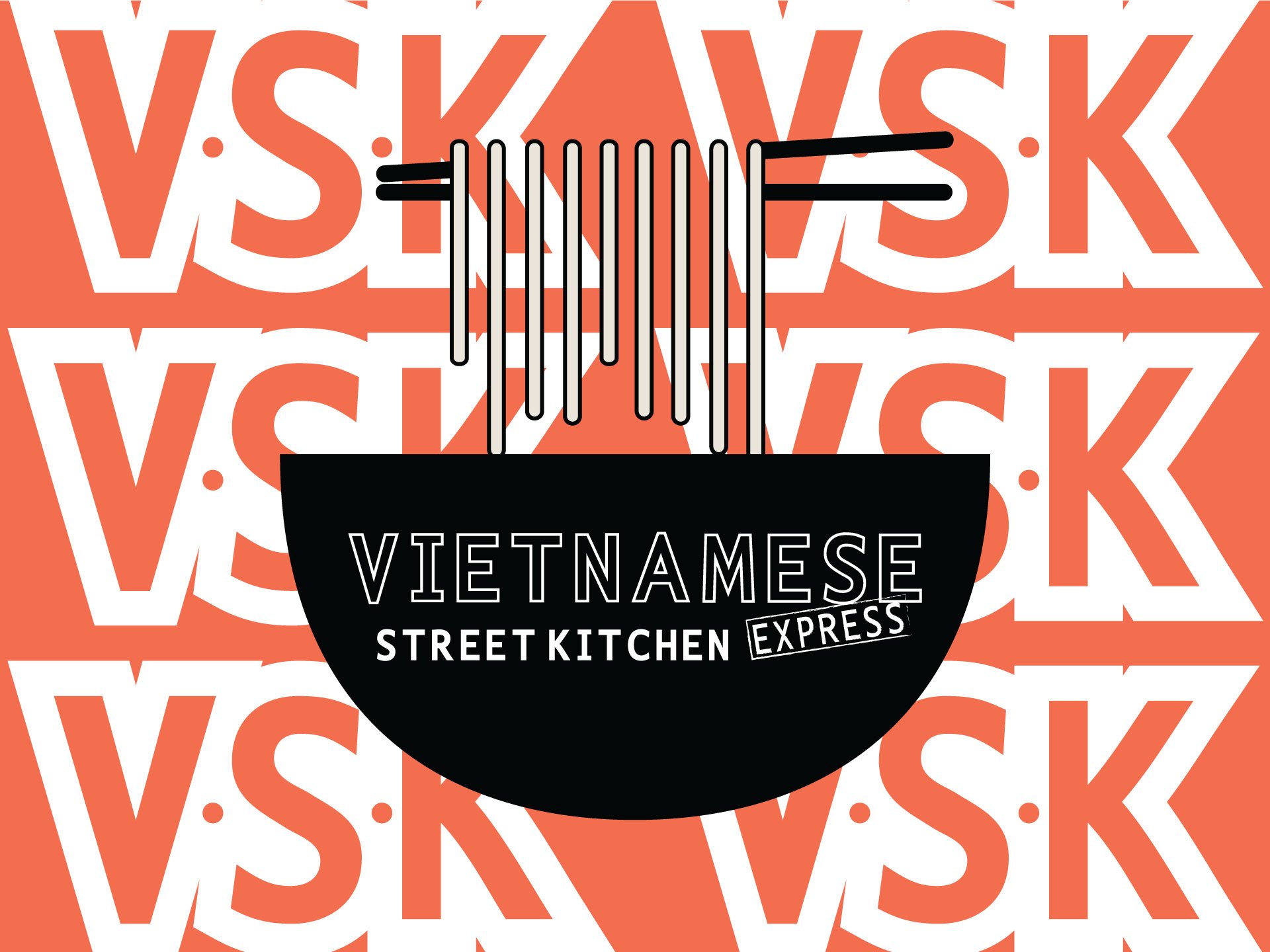
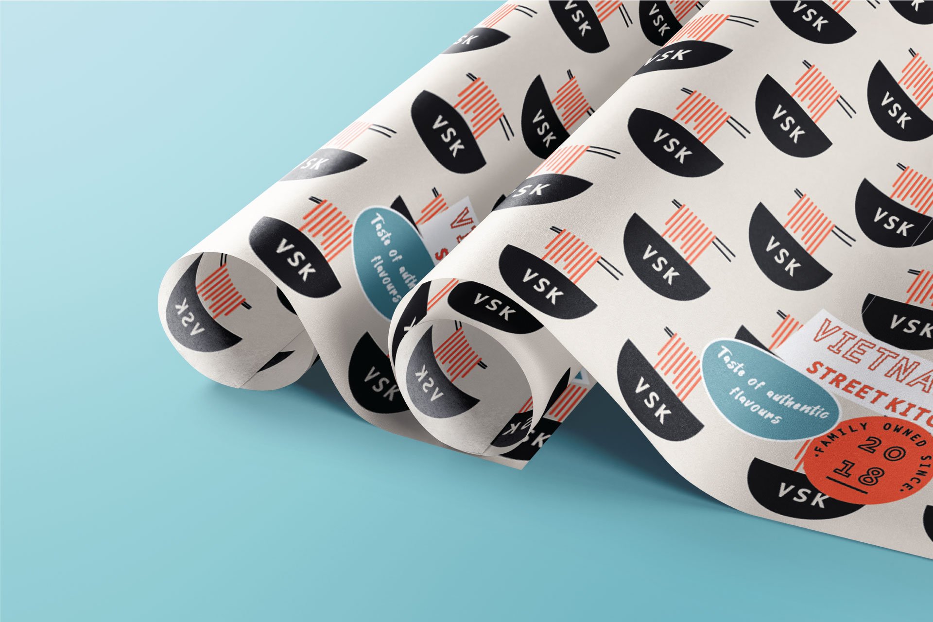
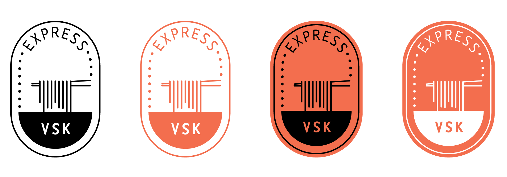
The solution was as simple as it is effective. Firstly, to take the VSK brandmark, using the existing Nexus Typewriter Pro typeface, and offset each letterform. Secondly, using two colours that are part of the existing brand system but seldom used; black and white. By contrasting a black letter with a white offset, the result has visual impact. This is applied to a two-tone background pattern in warm hues of vermillion orange.